Note
Go to the end to download the full example code
Visualising peak distributions
One of the data visualisation tools RamanSPy offers is the ramanspy.plot.peak_dist() - a method intended for the
visualisation of peak distributions.
As an example, we will use the training dataset of the Bacteria data provided within RamanSPy.
import numpy as np
from matplotlib import pyplot as plt

import ramanspy

dir_ = r"../../../../data/bacteria_data"
X_train, y_train = ramanspy.datasets.bacteria("train", folder=dir_)
bacteria_lists = [[X_train[i:i+2000, :]] for i in range(0, X_train.shape[0], 2000)]

bacteria_sample = bacteria_lists[:5]
bacteria_sample_labels = [f"Species {int(y_train[i*2000])}" for i in range(0, 5)]
Defining plot characteristics
# defining some bands we are interested in
bands = [400, 800, 1200, 1600]

# getting the corresponding colors using the default colormap
colors = list(plt.cm.get_cmap()(np.linspace(0, 1, len(bands))))
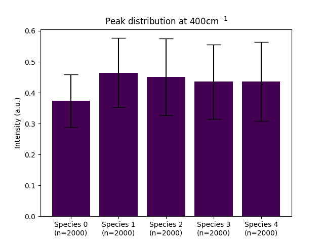
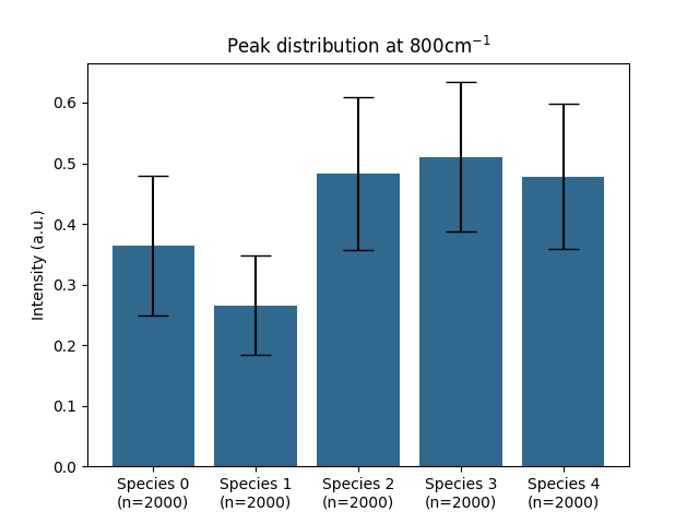
Comparing the peak distributions of the 5 species across the bands we are interested in
for band, color in zip(bands, colors):
    ramanspy.plot.peak_dist(bacteria_sample, band=band, title=f"Peak distribution at {band}cm$^{{{-1}}}$", labels=bacteria_sample_labels, color=color)


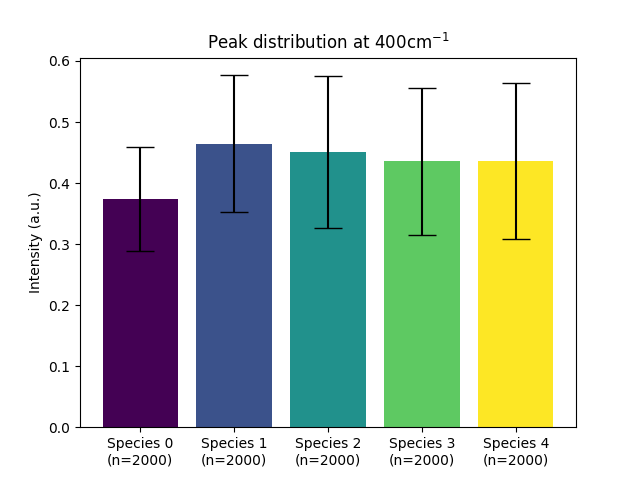
We can also use colors within individual plots
colors = list(plt.cm.get_cmap()(np.linspace(0, 1, len(bacteria_sample))))
ramanspy.plot.peak_dist(bacteria_sample, band=bands[0], title=f"Peak distribution at {bands[0]}cm$^{{{-1}}}$", labels=bacteria_sample_labels, color=colors)
<Axes: title={'center': 'Peak distribution at 400cm$^{-1}$'}, ylabel='Intensity (a.u.)'>
Total running time of the script: ( 0 minutes 0.449 seconds)